
SEMPITERNAL TYPOGRAPHY
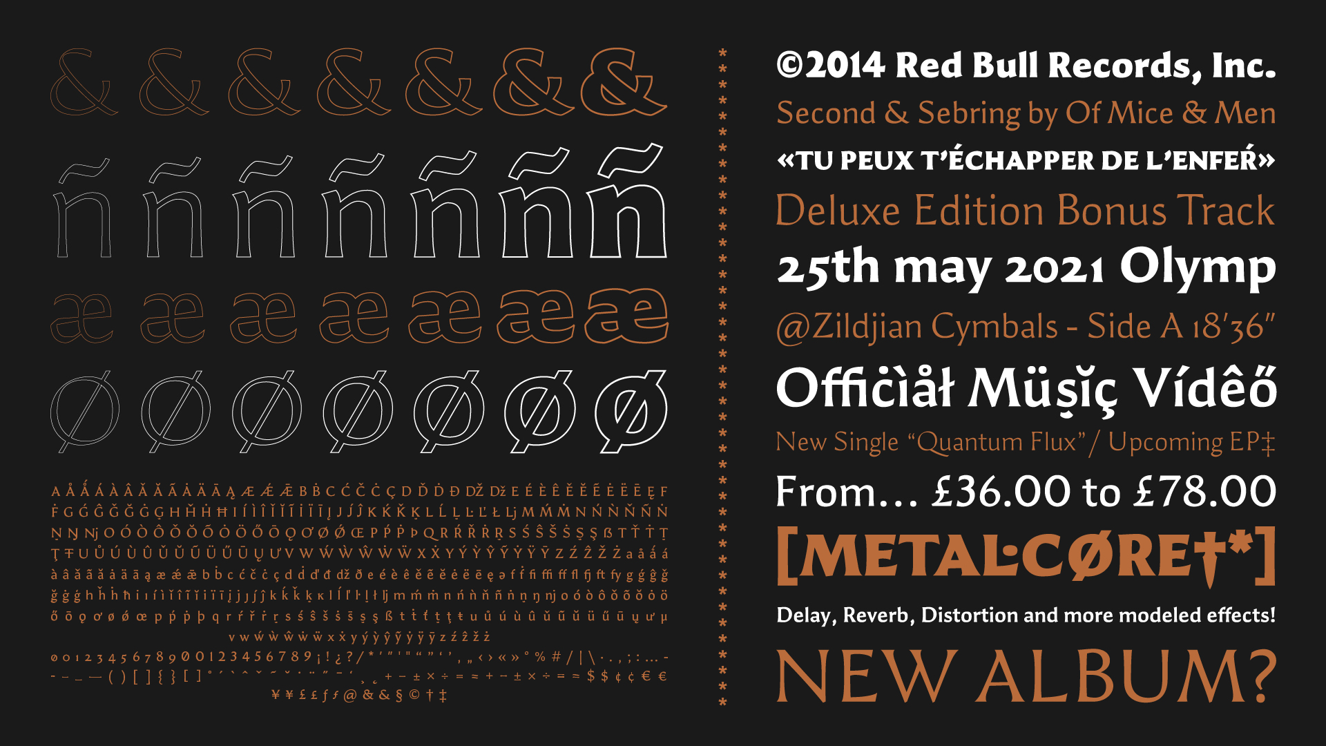
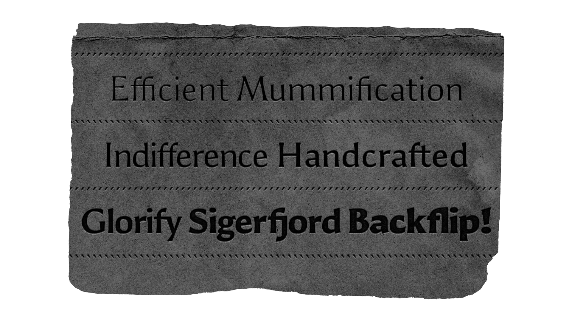
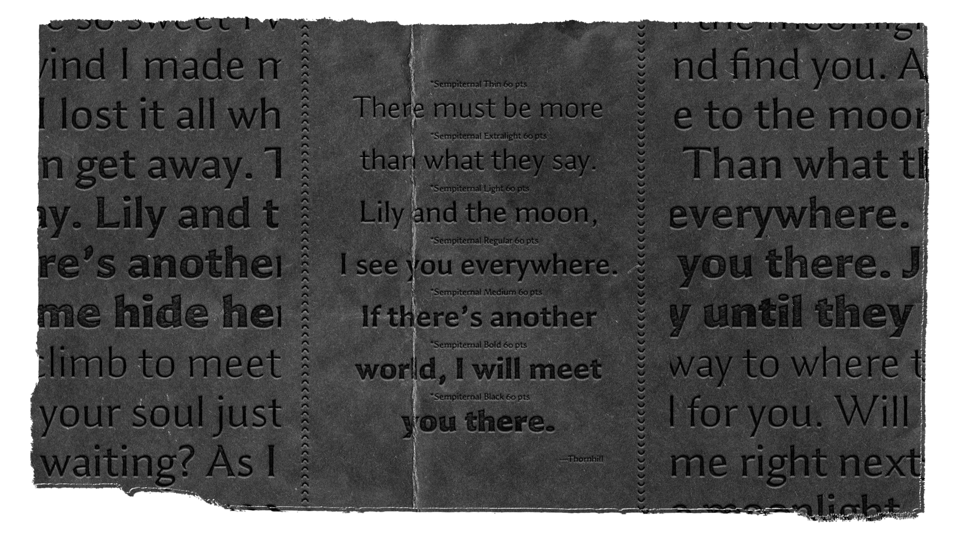
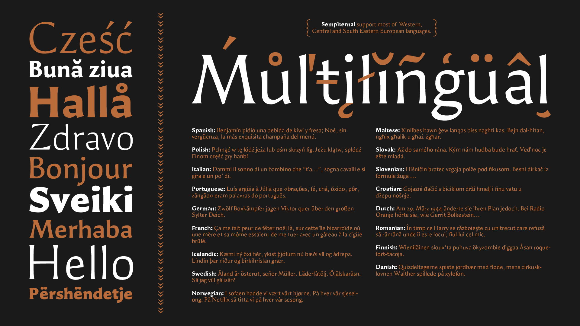
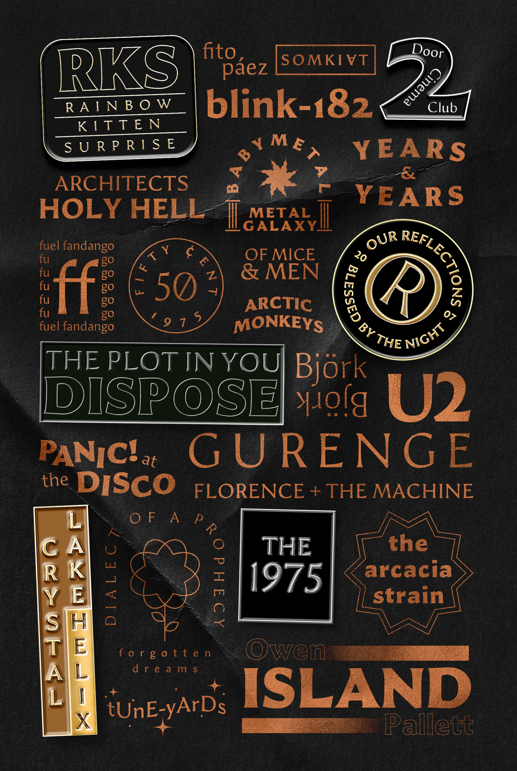
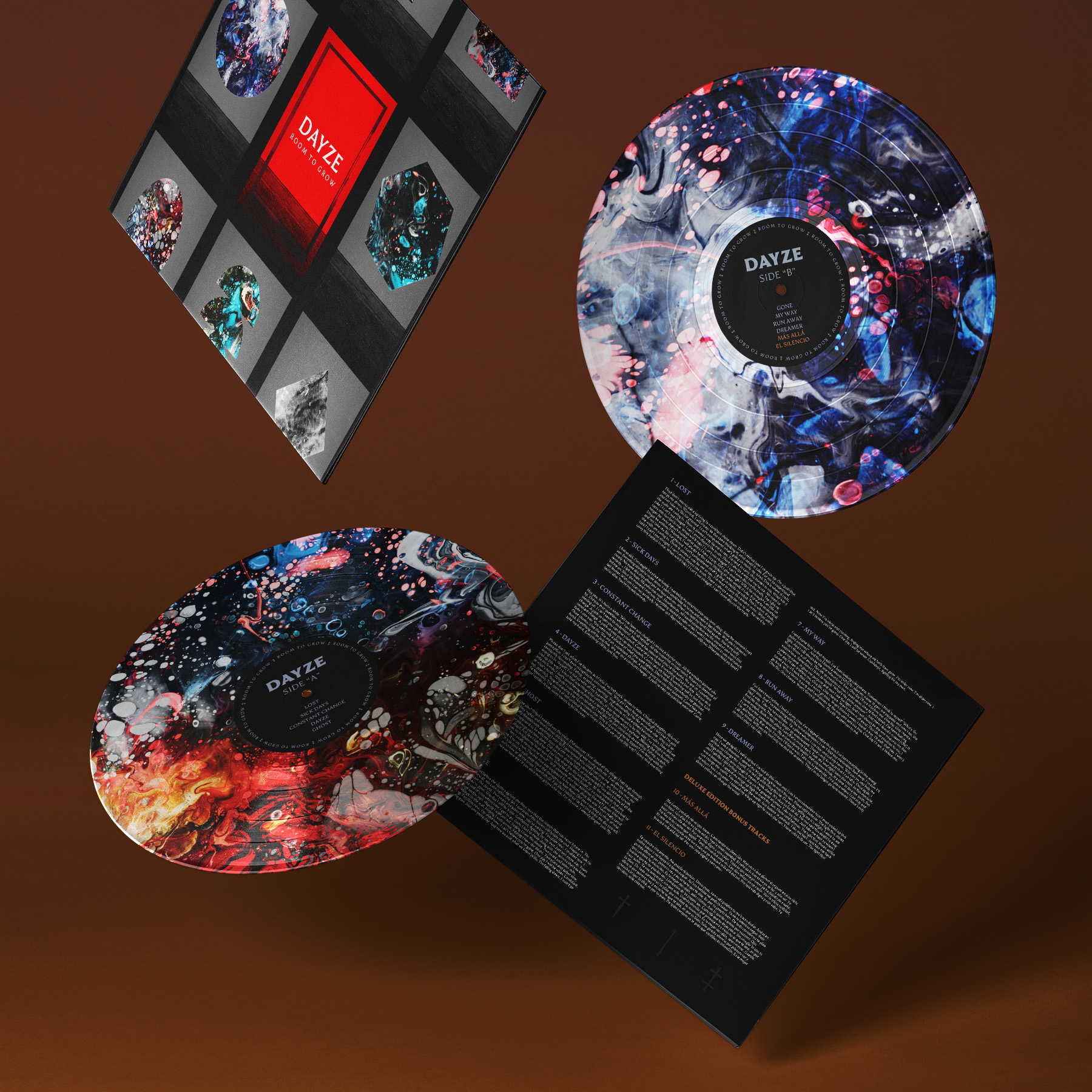
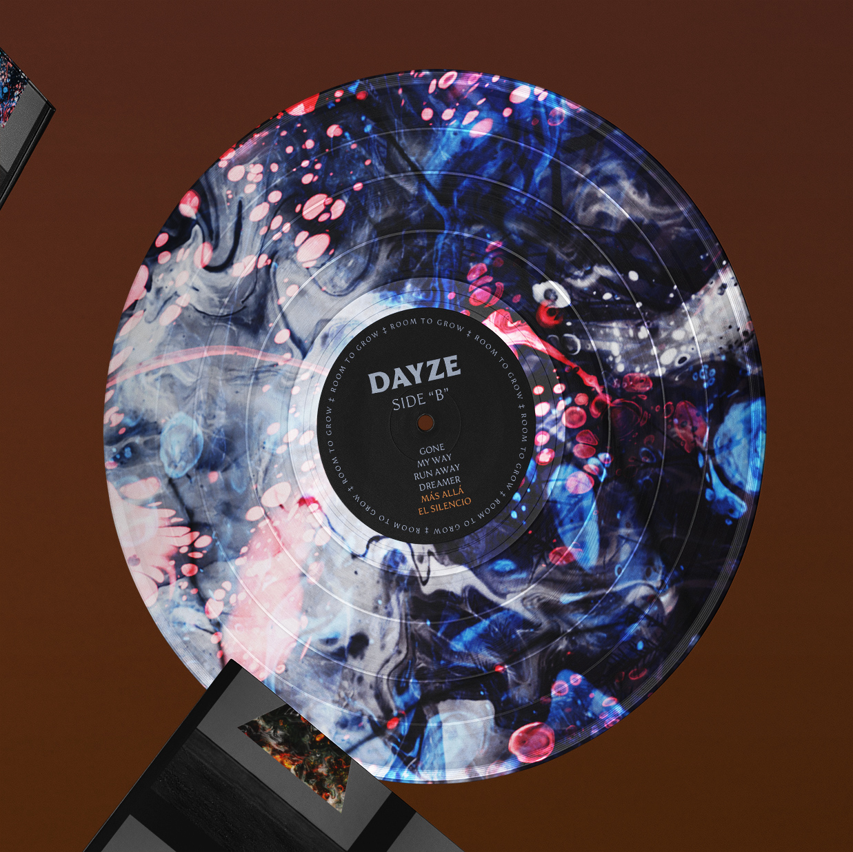
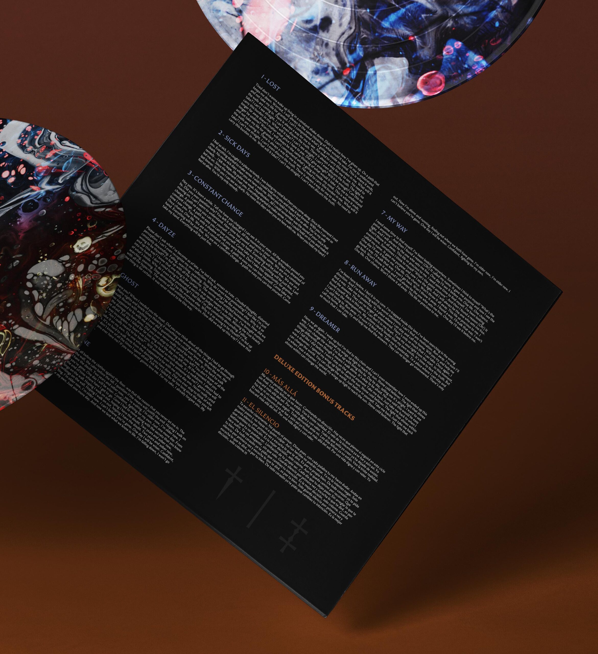
Sempiternal is a low-contrast typeface that meanders between a sans serif and a serif. Inspired by classical roman capitals with asymmetric flaring, the translation model of contrast, stone carving, and specially heavy music.
With its open contours, these characteristics help the design to have better readability in unexpected small sizes.
Client—Luisterdesign
Year—2020
Studio—Luisterdesign
Designer—Luisterdesign
Art Director—Luisterdesign




Let's get in touch
Based in Brooklyn, NY
Email: luisterdesign@gmail.com
Instagram: @luisterdesign
Twitter: @luisterdesign
Copyright © 2024 Luisterdesign
Graphic designer, Letter artist, and Type Designer
Website built with Love and Patient

